Immersa app
A festival companion app for the day around the fun: the lines, the sold-out food, and the moment your group scatters with no signal. Researched with 22 real event-goers, tested on three tasks, and designed using Claude.
Industry
Event Navigation
Role
UX Design, Research
Tools Used
Figma for concept sketch, Claude+Figma for building
TL;DR
TL;DR
Background
Background
Festivals and live events keep getting bigger, and the day keeps getting harder to actually enjoy. People love the event; it's everything around it that wears them down.
Festivals and live events keep getting bigger, and the day keeps getting harder to actually enjoy. People love the event; it's everything around it that wears them down.
Problem
Problem
Nothing out there is built for event day, so people cope with a screenshotted lineup, an official app that dies by noon, and a group chat that won't load. 12 of the 22 people we surveyed had lost their group at an event, most more than once.
Nothing out there is built for event day, so people cope with a screenshotted lineup, an official app that dies by noon, and a group chat that won't load. 12 of the 22 people we surveyed had lost their group at an event, most more than once.
Approach
Approach
We surveyed 22 people and tested wireframes with real users before building anything final. When the food flow scored 4.3 out of 7, we redesigned it, then I built all 35 hi-fi screens in Figma with Claude AI in the loop, checking every one by hand.
We surveyed 22 people and tested wireframes with real users before building anything final. When the food flow scored 4.3 out of 7, we redesigned it, then I built all 35 hi-fi screens in Figma with Claude AI in the loop, checking every one by hand.
Outcome
Outcome
Immersa puts navigation, schedules, live food info, and group-finding in one app, replacing five apps and a group chat. The flow that failed testing became the strongest part of the final design, and group-finding, the pain point people ranked first, scored a perfect 7 in testing.
Immersa puts navigation, schedules, live food info, and group-finding in one app, replacing five apps and a group chat. The flow that failed testing became the strongest part of the final design, and group-finding, the pain point people ranked first, scored a perfect 7 in testing.
5 to 1
Tools replaced
12/22
Lost their group at events
7/7
Ease of group finding on Immersa app
Background
Nobody buys a ticket to manage logistics.
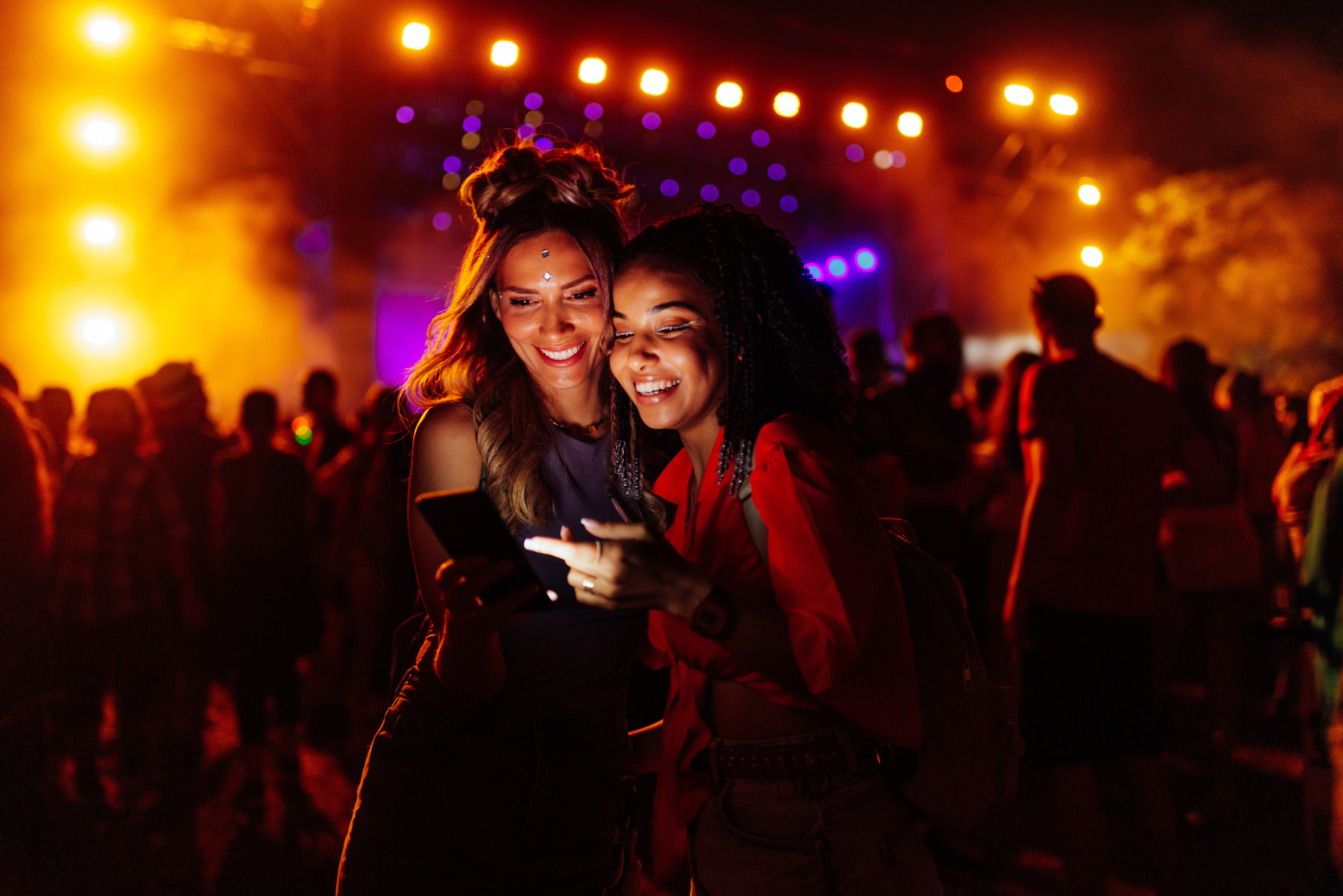
Festivals and live events keep getting bigger, and the day keeps getting harder to actually enjoy. You line up for food that's already sold out. You give up on finding water. And the moment you lose your friends is usually the moment your phone loses signal too.
People love the event. It's everything around it that wears them down.

Problem
Everyone's already cobbled together their own fix.
Before designing anything, we asked people how they actually get through an event day. Not one person described an app they liked. They walked us through their patchwork instead: a screenshotted lineup, an official app that is rendered useless as soon as the event starts, and a group chat that won't load.
A screenshotted lineup
An official app useless at the event
A group chat that won’t load
Observation #1
“I felt really anxious and stressed. I just waited in the same spot and told my friends I was lost.”
Observation #2
Connectivity came up unprompted, over and over. No signal breaks everything.
12/22
people we surveyed had lost their group at an event. Most of them, more than once.
Users
We asked 22 people. They told us what actually ruins the day.
Questions in the surveys were written to be non-leading: we wanted to hear how people experience events, not confirm what we already thought.
22
survey respondents, ages 23 to 34
1
first-person autoethnography
Silent Killer
Connectivity came up unprompted, over and over. No signal breaks everything.
Not The Music
The complaints were about lines and crowds, almost never the music.
Hardest To Find
Group, washrooms, water, and food topped the list of things nobody could locate.
DIY Already Wins
A screenshotted lineup beats the official app. People built their own fixes.
Hardest To Find
Group
12/22
Washroom
9/22
Water/Food
5/22
Ranked #1
When forced to prioritize, finding your group came out on top.

Emily
25 · Marketing Assistant
✦ Persona · “The Regular”
Bilingual
5+ events a year
Phone-native
Budget-conscious
Lives with roommates
Wants to be present at the event she saved up for, not the group’s logistics manager.
“I felt really anxious and stressed. I just waited in the same spot and told my friends I was lost.”
Roles & Responsibilities
A team of two. Full ownership, end to end.
I designed Immersa with Viviana Díaz. We did the research together, then split the rest of the build between us.
Mriganki
Survey design and synthesis
Design system in Figma
35-screen hi-fi prototype, AI-assisted build
Usability testing and iteration
Viviana
Wireframes
Competitive analysis
Persona development
Testing sessions
Scope & Constraints
A tight timeline. Real users.
Mobile first, on purpose.
AR and VR are where events are heading, and we designed with that in mind. But we scoped a phone app, because that's what solves the problem today.
Concept, not client.
We had no festival partner and no live vendor data. So we designed what that data should look like, then filled it with realistic content.
A small sample, treated honestly.
22 people isn't a statistic, and we didn't pretend it was. It was enough to rank the pain points and check our guesses against real experiences.
Testing over polish.
We had a few weeks which we spent on three real tasks based usability tests with real users and then iterated for the final product.
Mobile, today
• • •
•
AR, next
• • •
•
VR, the horizon
Workflow
Wireframes by hand. Hi-fi with AI in the loop.
We wireframed and tested in Figma first, then built the design system: festival-bright but clean, purple as the brand, Inter carrying the type. For the hi-fi build I brought Claude into the loop. Using the wireframes, Claude's Figma MCP generated all screens in Figma, and I went through every one by hand before any of them made it to the final iteration.
Research
•
Wireframes
•
Design system
•
Hi-fi build
•
Prototype
We tested the wireframes, and one flow flopped.
Three tasks with real users on the wireframe prototype, rated on a 7-point ease scale. Two came back perfect. Finding food came back at 4.3.
7/7
Find a friend
7/7
Nearest washroom
4.3/7
Find food
So we changed it
We put food on the map with a "Near you" card, so it stopped being a buried list
We renamed "Vendors" to "Food," because nobody at a festival thinks in vendors
We added a filter on the Home screen, so finding your way starts on the first tab
We made "Add to my schedule" one single action, the same everywhere it appears
We anchored Home as part of a floating nav, always one tap away
We added a group chat with live location sharing, and made Group open straight to the map

Before: food buried in a Vendors list, three taps deep.
After: a “Near you” card on the map, one tap to navigate.
Outcome
Five apps and a group chat, down to one app.
35
Hi-fidelity screens generated using Claude
Onboarding, maps, schedule, vendors, and group flows in one system.
4.3/7
Finding food task scored low on usability test
The task that failed testing became the strongest part of the final design.
#1
Group finding feature using live location
The pain point people ranked highest, and it scored a perfect 7 in testing.
Learning
What we learnt
The 4.3 taught us more than the 7s did. The perfect scores in usability testing felt great, but the low one told us where to go. Fixing the food flow ended up reshaping the map, the navigation, and even the naming conventions across the whole app.
Dead zones are the default, not the edge case. People brought up bad signal again and again without us ever asking. So offline reliability and location sharing that survives a dead zone became the core of the app.
AI is why we finished fast. It's not why the work is good. Generating 35 screens took days instead of weeks, but every screen still needed a human pass before it was actually right. That part doesn't get automated, and honestly, I wouldn't want it to.
Let’s build something great
Ready to work together? Get in touch and let’s talk about your next project.
Immersa app
A festival companion app for the day around the fun: the lines, the sold-out food, and the moment your group scatters with no signal. Researched with 22 real event-goers, tested on three tasks, and designed using Claude.
Industry
Event Navigation
Role
UX Design, Research
Tools Used
Figma for concept sketch, Claude+Figma for building
TL;DR
TL;DR
Background
Background
Festivals and live events keep getting bigger, and the day keeps getting harder to actually enjoy. People love the event; it's everything around it that wears them down.
Festivals and live events keep getting bigger, and the day keeps getting harder to actually enjoy. People love the event; it's everything around it that wears them down.
Problem
Problem
Nothing out there is built for event day, so people cope with a screenshotted lineup, an official app that dies by noon, and a group chat that won't load. 12 of the 22 people we surveyed had lost their group at an event, most more than once.
Nothing out there is built for event day, so people cope with a screenshotted lineup, an official app that dies by noon, and a group chat that won't load. 12 of the 22 people we surveyed had lost their group at an event, most more than once.
Approach
Approach
We surveyed 22 people and tested wireframes with real users before building anything final. When the food flow scored 4.3 out of 7, we redesigned it, then I built all 35 hi-fi screens in Figma with Claude AI in the loop, checking every one by hand.
We surveyed 22 people and tested wireframes with real users before building anything final. When the food flow scored 4.3 out of 7, we redesigned it, then I built all 35 hi-fi screens in Figma with Claude AI in the loop, checking every one by hand.
Outcome
Outcome
Immersa puts navigation, schedules, live food info, and group-finding in one app, replacing five apps and a group chat. The flow that failed testing became the strongest part of the final design, and group-finding, the pain point people ranked first, scored a perfect 7 in testing.
Immersa puts navigation, schedules, live food info, and group-finding in one app, replacing five apps and a group chat. The flow that failed testing became the strongest part of the final design, and group-finding, the pain point people ranked first, scored a perfect 7 in testing.
5 to 1
Tools replaced
12/22
Lost their group at events
7/7
Ease of group finding on Immersa app
Background
Nobody buys a ticket to manage logistics.
Festivals and live events keep getting bigger, and the day keeps getting harder to actually enjoy. You line up for food that's already sold out. You give up on finding water. And the moment you lose your friends is usually the moment your phone loses signal too.
People love the event. It's everything around it that wears them down.
Problem
Everyone's already cobbled together their own fix.
Before designing anything, we asked people how they actually get through an event day. Not one person described an app they liked. They walked us through their patchwork instead: a screenshotted lineup, an official app that is rendered useless as soon as the event starts, and a group chat that won't load.
A screenshotted lineup
An official app useless at the event
A group chat that won’t load
Observation #1
“I felt really anxious and stressed. I just waited in the same spot and told my friends I was lost.”
Observation #2
Connectivity came up unprompted, over and over. No signal breaks everything.
12/22
people we surveyed had lost their group at an event. Most of them, more than once.
Users
We asked 22 people. They told us what actually ruins the day.
Questions in the surveys were written to be non-leading: we wanted to hear how people experience events, not confirm what we already thought.
22
survey respondents, ages 23 to 34
1
first-person autoethnography
Silent Killer
Connectivity came up unprompted, over and over. No signal breaks everything.
Not The Music
The complaints were about lines and crowds, almost never the music.
Hardest To Find
Group, washrooms, water, and food topped the list of things nobody could locate.
DIY Already Wins
A screenshotted lineup beats the official app. People built their own fixes.
Hardest To Find
Group
12/22
Washroom
9/22
Water/Food
5/22
Ranked #1
When forced to prioritize, finding your group came out on top.
Emily
25 · Marketing Assistant
✦ Persona · “The Regular”
Bilingual
5+ events a year
Phone-native
Budget-conscious
Lives with roommates
Wants to be present at the event she saved up for, not the group’s logistics manager.
“I felt really anxious and stressed. I just waited in the same spot and told my friends I was lost.”
Roles & Responsibilities
A team of two. Full ownership, end to end.
I designed Immersa with Viviana Díaz. We did the research together, then split the rest of the build between us.
Mriganki
Survey design and synthesis
Design system in Figma
35-screen hi-fi prototype, AI-assisted build
Usability testing and iteration
Viviana
Wireframes
Competitive analysis
Persona development
Testing sessions
Scope & Constraints
A tight timeline. Real users.
Mobile first, on purpose.
AR and VR are where events are heading, and we designed with that in mind. But we scoped a phone app, because that's what solves the problem today.
Concept, not client.
We had no festival partner and no live vendor data. So we designed what that data should look like, then filled it with realistic content.
A small sample, treated honestly.
22 people isn't a statistic, and we didn't pretend it was. It was enough to rank the pain points and check our guesses against real experiences.
Testing over polish.
We had a few weeks which we spent on three real tasks based usability tests with real users and then iterated for the final product.
Mobile, today
• • •
•
AR, next
• • •
•
VR, the horizon
Workflow
Wireframes by hand. Hi-fi with AI in the loop.
We wireframed and tested in Figma first, then built the design system: festival-bright but clean, purple as the brand, Inter carrying the type. For the hi-fi build I brought Claude into the loop. Using the wireframes, Claude's Figma MCP generated all screens in Figma, and I went through every one by hand before any of them made it to the final iteration.
Research
•
Wireframes
•
Design system
•
Hi-fi build
•
Prototype
We tested the wireframes, and one flow flopped.
Three tasks with real users on the wireframe prototype, rated on a 7-point ease scale. Two came back perfect. Finding food came back at 4.3.
7/7
Find a friend
7/7
Nearest washroom
4.3/7
Find food
So we changed it
We put food on the map with a "Near you" card, so it stopped being a buried list
We renamed "Vendors" to "Food," because nobody at a festival thinks in vendors
We added a filter on the Home screen, so finding your way starts on the first tab
We made "Add to my schedule" one single action, the same everywhere it appears
We anchored Home as part of a floating nav, always one tap away
We added a group chat with live location sharing, and made Group open straight to the map
Before: food buried in a Vendors list, three taps deep.
After: a “Near you” card on the map, one tap to navigate.
Outcome
Five apps and a group chat, down to one app.
35
Hi-fidelity screens generated using Claude
Onboarding, maps, schedule, vendors, and group flows in one system.
4.3/7
Finding food task scored low on usability test
The task that failed testing became the strongest part of the final design.
#1
Group finding feature using live location
The pain point people ranked highest, and it scored a perfect 7 in testing.
Learning
What we learnt
The 4.3 taught us more than the 7s did. The perfect scores in usability testing felt great, but the low one told us where to go. Fixing the food flow ended up reshaping the map, the navigation, and even the naming conventions across the whole app.
Dead zones are the default, not the edge case. People brought up bad signal again and again without us ever asking. So offline reliability and location sharing that survives a dead zone became the core of the app.
AI is why we finished fast. It's not why the work is good. Generating 35 screens took days instead of weeks, but every screen still needed a human pass before it was actually right. That part doesn't get automated, and honestly, I wouldn't want it to.
Let’s build something great
Ready to work together? Get in touch and let’s talk about your next project.
Immersa app
A festival companion app for the day around the fun: the lines, the sold-out food, and the moment your group scatters with no signal. Researched with 22 real event-goers, tested on three tasks, and designed using Claude.
Industry
Event Navigation
Role
UX Design, Research
Tools Used
Figma for concept sketch, Claude+Figma for building
TL;DR
TL;DR
Background
Background
Festivals and live events keep getting bigger, and the day keeps getting harder to actually enjoy. People love the event; it's everything around it that wears them down.
Festivals and live events keep getting bigger, and the day keeps getting harder to actually enjoy. People love the event; it's everything around it that wears them down.
Problem
Problem
Nothing out there is built for event day, so people cope with a screenshotted lineup, an official app that dies by noon, and a group chat that won't load. 12 of the 22 people we surveyed had lost their group at an event, most more than once.
Nothing out there is built for event day, so people cope with a screenshotted lineup, an official app that dies by noon, and a group chat that won't load. 12 of the 22 people we surveyed had lost their group at an event, most more than once.
Approach
Approach
We surveyed 22 people and tested wireframes with real users before building anything final. When the food flow scored 4.3 out of 7, we redesigned it, then I built all 35 hi-fi screens in Figma with Claude AI in the loop, checking every one by hand.
We surveyed 22 people and tested wireframes with real users before building anything final. When the food flow scored 4.3 out of 7, we redesigned it, then I built all 35 hi-fi screens in Figma with Claude AI in the loop, checking every one by hand.
Outcome
Outcome
Immersa puts navigation, schedules, live food info, and group-finding in one app, replacing five apps and a group chat. The flow that failed testing became the strongest part of the final design, and group-finding, the pain point people ranked first, scored a perfect 7 in testing.
Immersa puts navigation, schedules, live food info, and group-finding in one app, replacing five apps and a group chat. The flow that failed testing became the strongest part of the final design, and group-finding, the pain point people ranked first, scored a perfect 7 in testing.
5 to 1
Tools replaced
12/22
Lost their group at events
7/7
Ease of group finding on Immersa app
Background
Nobody buys a ticket to manage logistics.
Festivals and live events keep getting bigger, and the day keeps getting harder to actually enjoy. You line up for food that's already sold out. You give up on finding water. And the moment you lose your friends is usually the moment your phone loses signal too.
People love the event. It's everything around it that wears them down.
Problem
Everyone's already cobbled together their own fix.
Before designing anything, we asked people how they actually get through an event day. Not one person described an app they liked. They walked us through their patchwork instead: a screenshotted lineup, an official app that is rendered useless as soon as the event starts, and a group chat that won't load.
A screenshotted lineup
An official app useless at the event
A group chat that won’t load
Observation #1
“I felt really anxious and stressed. I just waited in the same spot and told my friends I was lost.”
Observation #2
Connectivity came up unprompted, over and over. No signal breaks everything.
12/22
people we surveyed had lost their group at an event. Most of them, more than once.
Users
We asked 22 people. They told us what actually ruins the day.
Questions in the surveys were written to be non-leading: we wanted to hear how people experience events, not confirm what we already thought.
22
survey respondents, ages 23 to 34
1
first-person autoethnography
Silent Killer
Connectivity came up unprompted, over and over. No signal breaks everything.
Not The Music
The complaints were about lines and crowds, almost never the music.
Hardest To Find
Group, washrooms, water, and food topped the list of things nobody could locate.
DIY Already Wins
A screenshotted lineup beats the official app. People built their own fixes.
Hardest To Find
Group
12/22
Washroom
9/22
Water/Food
5/22
Ranked #1
When forced to prioritize, finding your group came out on top.
Emily
25 · Marketing Assistant
✦ Persona · “The Regular”
Bilingual
5+ events a year
Phone-native
Budget-conscious
Lives with roommates
Wants to be present at the event she saved up for, not the group’s logistics manager.
“I felt really anxious and stressed. I just waited in the same spot and told my friends I was lost.”
Roles & Responsibilities
A team of two. Full ownership, end to end.
I designed Immersa with Viviana Díaz. We did the research together, then split the rest of the build between us.
Mriganki
Survey design and synthesis
Design system in Figma
35-screen hi-fi prototype, AI-assisted build
Usability testing and iteration
Viviana
Wireframes
Competitive analysis
Persona development
Testing sessions
Scope & Constraints
A tight timeline. Real users.
Mobile first, on purpose.
AR and VR are where events are heading, and we designed with that in mind. But we scoped a phone app, because that's what solves the problem today.
Concept, not client.
We had no festival partner and no live vendor data. So we designed what that data should look like, then filled it with realistic content.
A small sample, treated honestly.
22 people isn't a statistic, and we didn't pretend it was. It was enough to rank the pain points and check our guesses against real experiences.
Testing over polish.
We had a few weeks which we spent on three real tasks based usability tests with real users and then iterated for the final product.
Mobile, today
• • •
•
AR, next
• • •
•
VR, the horizon
Workflow
Wireframes by hand. Hi-fi with AI in the loop.
We wireframed and tested in Figma first, then built the design system: festival-bright but clean, purple as the brand, Inter carrying the type. For the hi-fi build I brought Claude into the loop. Using the wireframes, Claude's Figma MCP generated all screens in Figma, and I went through every one by hand before any of them made it to the final iteration.
Research
•
Wireframes
•
Design system
•
Hi-fi build
•
Prototype
We tested the wireframes, and one flow flopped.
Three tasks with real users on the wireframe prototype, rated on a 7-point ease scale. Two came back perfect. Finding food came back at 4.3.
7/7
Find a friend
7/7
Nearest washroom
4.3/7
Find food
So we changed it
We put food on the map with a "Near you" card, so it stopped being a buried list
We renamed "Vendors" to "Food," because nobody at a festival thinks in vendors
We added a filter on the Home screen, so finding your way starts on the first tab
We made "Add to my schedule" one single action, the same everywhere it appears
We anchored Home as part of a floating nav, always one tap away
We added a group chat with live location sharing, and made Group open straight to the map
Before: food buried in a Vendors list, three taps deep.
After: a “Near you” card on the map, one tap to navigate.
Outcome
Five apps and a group chat, down to one app.
35
Hi-fidelity screens generated using Claude
Onboarding, maps, schedule, vendors, and group flows in one system.
4.3/7
Finding food task scored low on usability test
The task that failed testing became the strongest part of the final design.
#1
Group finding feature using live location
The pain point people ranked highest, and it scored a perfect 7 in testing.
Learning
What we learnt
The 4.3 taught us more than the 7s did. The perfect scores in usability testing felt great, but the low one told us where to go. Fixing the food flow ended up reshaping the map, the navigation, and even the naming conventions across the whole app.
Dead zones are the default, not the edge case. People brought up bad signal again and again without us ever asking. So offline reliability and location sharing that survives a dead zone became the core of the app.
AI is why we finished fast. It's not why the work is good. Generating 35 screens took days instead of weeks, but every screen still needed a human pass before it was actually right. That part doesn't get automated, and honestly, I wouldn't want it to.
Let’s build something great
Ready to work together? Get in touch and let’s talk about your next project.