UX Design & Research
Freshii Usability Testing
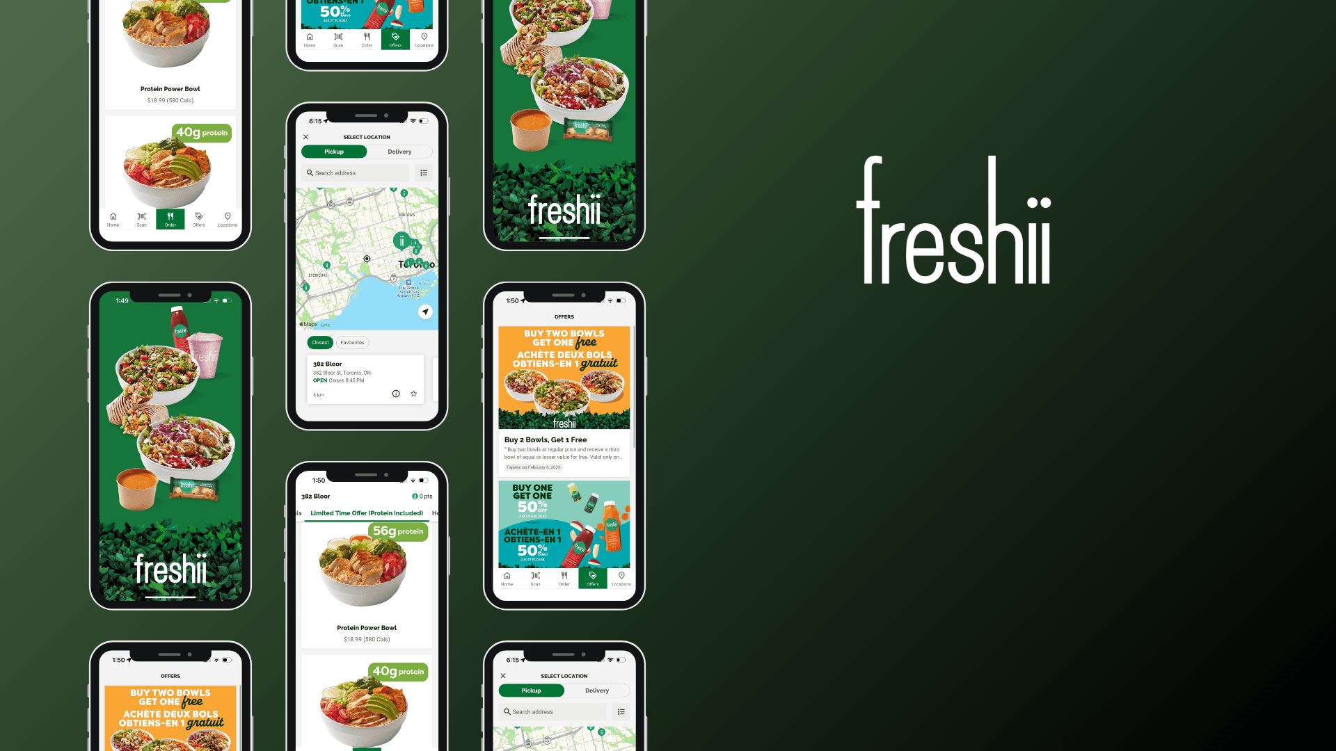
This usability testing project explored how users navigate the Freshii app to place orders, customize meals, and access nutrition information, with the goal of identifying key pain points and opportunities to improve clarity, efficiency, and decision-making throughout the ordering experience.
Year :
2025
Industry :
Food Delivery App
Client :
Freshii - Academic Research
Project Duration :
4 weeks
Problem Statement :
Freshii’s digital ordering experience can be confusing for users, especially when browsing the menu, customizing meals, or completing checkout. Users may abandon orders or feel frustrated, impacting satisfaction and repeat usage. The project aimed to uncover usability issues and identify opportunities to make the experience more intuitive, efficient, and enjoyable.
Research Methodology :
Usability Testing: Conducted 6 sessions where participants completed key tasks such as menu browsing, customizing meals, and placing orders. Observed pain points, hesitations, and errors.
User Interviews: Followed up with participants to understand motivations, preferences, and frustrations with digital ordering.
Heuristic Evaluation: Reviewed the app and website against usability principles to identify inconsistencies, navigation challenges, and accessibility gaps.
Surveys: Collected quantitative feedback from 15 users on satisfaction, ease of use, and likelihood to reorder.


Research Findings & Recommendations :
Navigation Confusion: Users struggled to find items and customize orders.
Recommendation: Simplify menu structure, use clear labels, and guide users step-by-step for customizations.Checkout Friction: Multiple steps and unclear progress caused frustration.
Recommendation: Streamline the checkout flow, add a visual progress tracker, and allow quick edits before payment.Visual Overload: Dense layouts distracted users from key information.
Recommendation: Prioritize essential info, declutter screens, and use visual hierarchy to guide decisions.Limited Feedback: Users were unsure if actions (like adding items or applying discounts) were successful.
Recommendation: Provide immediate visual or textual confirmations for all interactions.Cross-Device Inconsistency: Experiences varied between mobile and desktop.
Recommendation: Standardize interface and interactions across devices for a seamless experience.
More Projects


UX Design & Research
Freshii Usability Testing
This usability testing project explored how users navigate the Freshii app to place orders, customize meals, and access nutrition information, with the goal of identifying key pain points and opportunities to improve clarity, efficiency, and decision-making throughout the ordering experience.
Year :
2025
Industry :
Food Delivery App
Client :
Freshii - Academic Research
Project Duration :
4 weeks
Problem Statement :
Freshii’s digital ordering experience can be confusing for users, especially when browsing the menu, customizing meals, or completing checkout. Users may abandon orders or feel frustrated, impacting satisfaction and repeat usage. The project aimed to uncover usability issues and identify opportunities to make the experience more intuitive, efficient, and enjoyable.
Research Methodology :
Usability Testing: Conducted 6 sessions where participants completed key tasks such as menu browsing, customizing meals, and placing orders. Observed pain points, hesitations, and errors.
User Interviews: Followed up with participants to understand motivations, preferences, and frustrations with digital ordering.
Heuristic Evaluation: Reviewed the app and website against usability principles to identify inconsistencies, navigation challenges, and accessibility gaps.
Surveys: Collected quantitative feedback from 15 users on satisfaction, ease of use, and likelihood to reorder.
Research Findings & Recommendations :
Navigation Confusion: Users struggled to find items and customize orders.
Recommendation: Simplify menu structure, use clear labels, and guide users step-by-step for customizations.Checkout Friction: Multiple steps and unclear progress caused frustration.
Recommendation: Streamline the checkout flow, add a visual progress tracker, and allow quick edits before payment.Visual Overload: Dense layouts distracted users from key information.
Recommendation: Prioritize essential info, declutter screens, and use visual hierarchy to guide decisions.Limited Feedback: Users were unsure if actions (like adding items or applying discounts) were successful.
Recommendation: Provide immediate visual or textual confirmations for all interactions.Cross-Device Inconsistency: Experiences varied between mobile and desktop.
Recommendation: Standardize interface and interactions across devices for a seamless experience.
More Projects
UX Design & Research
Freshii Usability Testing
This usability testing project explored how users navigate the Freshii app to place orders, customize meals, and access nutrition information, with the goal of identifying key pain points and opportunities to improve clarity, efficiency, and decision-making throughout the ordering experience.
Year :
2025
Industry :
Food Delivery App
Client :
Freshii - Academic Research
Project Duration :
4 weeks
Problem Statement :
Freshii’s digital ordering experience can be confusing for users, especially when browsing the menu, customizing meals, or completing checkout. Users may abandon orders or feel frustrated, impacting satisfaction and repeat usage. The project aimed to uncover usability issues and identify opportunities to make the experience more intuitive, efficient, and enjoyable.
Research Methodology :
Usability Testing: Conducted 6 sessions where participants completed key tasks such as menu browsing, customizing meals, and placing orders. Observed pain points, hesitations, and errors.
User Interviews: Followed up with participants to understand motivations, preferences, and frustrations with digital ordering.
Heuristic Evaluation: Reviewed the app and website against usability principles to identify inconsistencies, navigation challenges, and accessibility gaps.
Surveys: Collected quantitative feedback from 15 users on satisfaction, ease of use, and likelihood to reorder.
Research Findings & Recommendations :
Navigation Confusion: Users struggled to find items and customize orders.
Recommendation: Simplify menu structure, use clear labels, and guide users step-by-step for customizations.Checkout Friction: Multiple steps and unclear progress caused frustration.
Recommendation: Streamline the checkout flow, add a visual progress tracker, and allow quick edits before payment.Visual Overload: Dense layouts distracted users from key information.
Recommendation: Prioritize essential info, declutter screens, and use visual hierarchy to guide decisions.Limited Feedback: Users were unsure if actions (like adding items or applying discounts) were successful.
Recommendation: Provide immediate visual or textual confirmations for all interactions.Cross-Device Inconsistency: Experiences varied between mobile and desktop.
Recommendation: Standardize interface and interactions across devices for a seamless experience.