UX Design & Research
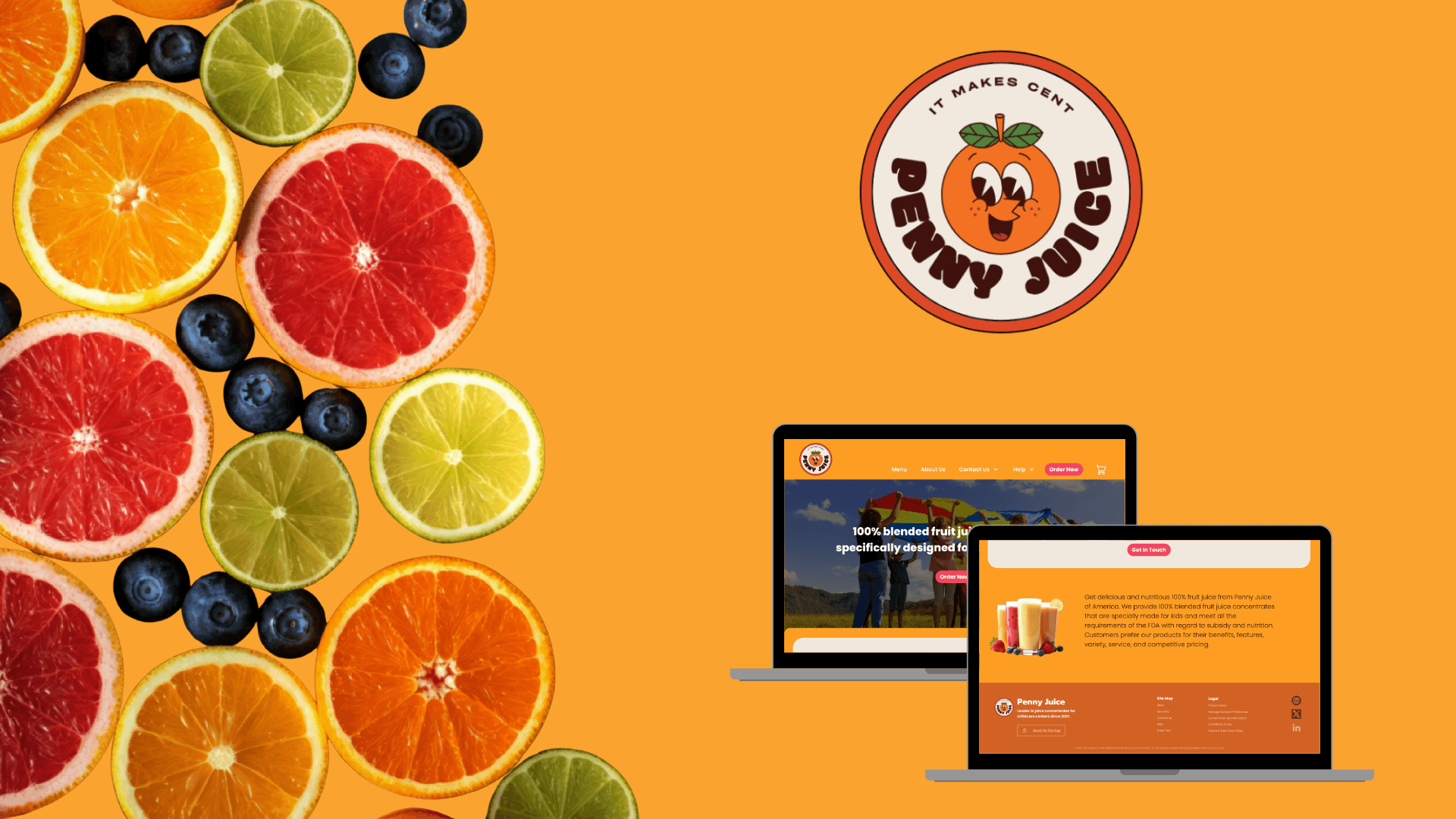
Penny Juice Header Footer Redesign
The header and footer redesign focused on improving navigation clarity, brand presence, and conversion flow. By simplifying the menu structure, strengthening calls-to-action, and organizing key information in the footer, the redesign creates a more intuitive browsing experience while reinforcing trust and accessibility across all pages.
Year :
2025
Industry :
Food & Beverage
Client :
Penny Juice - Academic Project
Project Duration :
2 weeks
Problem Statement :
Penny Juice’s website header and footer lacked visual hierarchy, clear navigation, and cohesive branding, making it difficult for users to quickly find key information or take action. The goal was to redesign these structural elements to improve clarity, usability, and visual consistency.
Research Methodology :
Conducted a heuristic evaluation to identify usability and hierarchy issues.
Reviewed analytics and user behavior patterns to understand navigation drop-offs.
Performed a competitive analysis of similar food and beverage websites.
Gathered informal user feedback on clarity, navigation, and visual appeal.


Design Approach :
Focused on strengthening visual hierarchy, simplifying navigation, and aligning the design with Penny Juice’s vibrant brand identity. The redesign introduced clearer menu grouping, stronger calls-to-action, improved typography, and a more structured, visually balanced footer to enhance usability and trust.
More Projects


UX Design & Research
Penny Juice Header Footer Redesign
The header and footer redesign focused on improving navigation clarity, brand presence, and conversion flow. By simplifying the menu structure, strengthening calls-to-action, and organizing key information in the footer, the redesign creates a more intuitive browsing experience while reinforcing trust and accessibility across all pages.
Year :
2025
Industry :
Food & Beverage
Client :
Penny Juice - Academic Project
Project Duration :
2 weeks
Problem Statement :
Penny Juice’s website header and footer lacked visual hierarchy, clear navigation, and cohesive branding, making it difficult for users to quickly find key information or take action. The goal was to redesign these structural elements to improve clarity, usability, and visual consistency.
Research Methodology :
Conducted a heuristic evaluation to identify usability and hierarchy issues.
Reviewed analytics and user behavior patterns to understand navigation drop-offs.
Performed a competitive analysis of similar food and beverage websites.
Gathered informal user feedback on clarity, navigation, and visual appeal.
Design Approach :
Focused on strengthening visual hierarchy, simplifying navigation, and aligning the design with Penny Juice’s vibrant brand identity. The redesign introduced clearer menu grouping, stronger calls-to-action, improved typography, and a more structured, visually balanced footer to enhance usability and trust.
More Projects
UX Design & Research
Penny Juice Header Footer Redesign
The header and footer redesign focused on improving navigation clarity, brand presence, and conversion flow. By simplifying the menu structure, strengthening calls-to-action, and organizing key information in the footer, the redesign creates a more intuitive browsing experience while reinforcing trust and accessibility across all pages.
Year :
2025
Industry :
Food & Beverage
Client :
Penny Juice - Academic Project
Project Duration :
2 weeks
Problem Statement :
Penny Juice’s website header and footer lacked visual hierarchy, clear navigation, and cohesive branding, making it difficult for users to quickly find key information or take action. The goal was to redesign these structural elements to improve clarity, usability, and visual consistency.
Research Methodology :
Conducted a heuristic evaluation to identify usability and hierarchy issues.
Reviewed analytics and user behavior patterns to understand navigation drop-offs.
Performed a competitive analysis of similar food and beverage websites.
Gathered informal user feedback on clarity, navigation, and visual appeal.
Design Approach :
Focused on strengthening visual hierarchy, simplifying navigation, and aligning the design with Penny Juice’s vibrant brand identity. The redesign introduced clearer menu grouping, stronger calls-to-action, improved typography, and a more structured, visually balanced footer to enhance usability and trust.